In the realm of visual communication, we often discuss design as a universal language. We assume that the principles of balance, contrast, and hierarchy operate the same way whether the viewer is in London, New York, or Bangkok. However, this assumption ignores a critical component of visual rhetoric: the cultural lens through which the audience decodes the message.
For graphic designers and marketers operating globally, understanding the distinction between ‘low-context’ and ‘high-context’ cultures is as vital as understanding colour theory. While a minimalist, text-heavy design might convey authority in the West, it can be perceived as cold or aggressively direct in Southeast Asia. To truly communicate across borders, we must move beyond simple translation and analyse the visual semiotics that underpin international advertising.
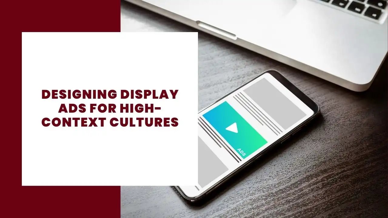
High-Context vs. Low-Context
The concept of high and low-context cultures, originally proposed by anthropologist Edward T. Hall, offers a framework for understanding how different societies communicate. In low-context cultures like the UK, USA, and Germany, communication is explicit. The message is in the text. If you want someone to buy a product, you say “Buy Now”. The visual rhetoric supports the text, often using arrows or bold typography to direct the eye to the call to action (CTA).
In contrast, high-context cultures such as Japan, Thailand, and China rely heavily on implicit communication. The meaning is not in the words, but in the context. This includes the relationship, the setting, and the visual mood. According to cultural research by IOR World, Thailand exemplifies a high-context society where directness is often perceived as aggression or a lack of sophistication. Their analysis highlights that relationships determine the nature of communication, and candour is often avoided to maintain social harmony.
For a display ad, this means the rhetorical strategy must shift from logos (logic or direct argument) to pathos (emotion or atmosphere). A direct imperative like “Get 50% Off Today” may disrupt the visual harmony that a Thai audience expects. This effectively damages the brand’s ethos before the user even clicks. Navigating these subtle, high-context visual cues often requires the local expertise of a Google Ads agency in Thailand to ensure the creative resonates rather than offends. A local partner acts as a cultural editor. They ensure that the visual rhetoric aligns with local values, preventing costly mistakes that a purely translation-based approach might miss.
Visual Ambiguity as a Narrative Device
Designing for high-context cultures requires a shift in how we view visual storytelling. In Western design, ambiguity is often seen as a failure of communication. We want the data to be clear and the conclusion to be inescapable. However, in high-context marketing, visual ambiguity is a feature rather than a bug. It invites the viewer to participate in the construction of meaning.
This aligns with broader theories of visual literacy. As noted in an analysis of visual storytelling paradigms, effective design often requires the viewer to engage in both macro and micro readings to ‘fill in the gaps’ of a narrative. While that discussion focused on data visualisation and infographics, the principle holds true for international display ads. In a Thai context, the “gap” is not filled by data interpretation, but by cultural intuition.
When designing for these markets, consider the following rhetorical shifts:
- From Explicit to Implicit: Instead of a product shot with a price tag, use imagery that evokes the feeling of owning the product.
- From Individual to Collective: Western ads often feature a single hero figure standing out. High-context ads often feature groups, families, or harmonious interactions. This signals that the product strengthens social bonds.
- From Hard Sell to Soft Suggestion: The CTA should be invited rather than demanded. Buttons might use softer colours or less imperative language, such as “See More” rather than “Buy Now”.
Navigating the Nuances of ‘Face’ and Hierarchy
One of the most complex rhetorical elements in Asian markets is the concept of ‘Face’ (in Thailand, Sia-na). This social currency involves dignity, prestige, and reputation. Visuals that are too loud, clash in colour, or use disrespectful imagery can cause a brand to lose face instantly. In the West, shock tactics might generate buzz. In Thailand, they often generate silence and avoidance.
For example, the colour palette in Thailand is deeply tied to astrology and daily rituals. Many Thais wear specific colours on specific days, such as yellow on Mondays for the King or pink on Tuesdays. A mismatch here is not just an aesthetic error. It is a rhetorical failure that signals a lack of cultural literacy. Furthermore, the vertical placement of objects in a design carries weight. The head is considered sacred, while the feet are considered lowly. A design that inadvertently places a product near someone’s feet, or crops a head disrespectfully, can offend an entire demographic.
While the technical setup of a digital advertising campaign might be universal, the visual strategy is certainly not. Designers must recognise that their choices are not neutral. Every colour, crop, and font choice carries cultural weight. Ignoring these unwritten rules essentially silences the brand in a market that values social propriety above volume.
Conclusion
Visual rhetoric is never practiced in a vacuum. It is always situated within a specific cultural framework. As designers and marketers, our job is not just to make things look good. We must ensure they mean the right thing to the right people. By respecting the principles of high-context communication and understanding the power of implicit visual narratives, we can create global campaigns that speak to audiences with the same nuance and sophistication as their local dialect.