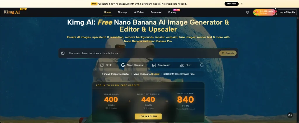
You finally find a business name that feels perfect. It is memorable, easy to pronounce, and available for your website. Then you place it on a business card, and something feels wrong. The name sounds friendly, but the design looks formal. Your planned colors suggest luxury when the business is supposed to feel affordable. This disconnect is surprisingly easy to overlook during branding. Visual experimentation, including image-generation resources such as Kimg AI, offers a way to explore how a promising name might translate into a recognizable visual identity before committing to expensive materials.
A Name Creates Expectations Before Customers See Your Product
Business names carry emotional signals. A name like Little Lantern might suggest warmth and familiarity, while something like Northline Advisory could communicate seriousness and stability.
Neither impression is automatically right or wrong. What matters is whether the name supports the experience customers will actually receive.
Imagine opening a bakery called Sunday Crumbs. The name suggests something relaxed and welcoming. If the storefront features severe black lettering, metallic surfaces, and corporate photography, customers may receive mixed signals.
That does not mean every friendly business needs pastel colors or hand-drawn illustrations. It means visual decisions should be intentional.
Before choosing a design, write down three expectations your name creates. They might include playful, dependable, adventurous, elegant, or practical.
Then ask whether the planned visuals reinforce those expectations.
This exercise works particularly well for businesses that sell an experience rather than a physical product, including cafés, wellness studios, event companies, and creative services.
Test the Name in Real Situations, Not Just on a Logo
A business rarely exists as a logo floating against a white background. Customers encounter it on storefronts, packaging, social posts, signs, and advertisements.
That is why founders should test visual direction in settings that resemble actual customer encounters.
For a neighborhood coffee shop, imagine the name printed above the entrance. For a tutoring service, picture it on a flyer that parents might receive outside a school.
A good branding direction needs to remain recognizable across these everyday contexts.
Consider three questions:
- Would customers understand what kind of business this is?
- Does the overall appearance match the expected price and service level?
- Would the name remain memorable after someone sees it briefly?
You do not need finalized artwork to answer these questions. Early concept images and rough layouts are often enough to reveal mismatches.
The aim is to identify the right visual direction, not produce finished marketing materials before the business strategy is clear.
Three Visual Tests Worth Running Before Launch
A promising business name can survive several different design treatments. Testing them helps founders separate what genuinely fits the business from what simply looks fashionable.
1. The First-Impression Test
Create three concept images representing distinctly different personalities.
For a skincare brand, one might feel clinical and minimal, another natural and handcrafted, and the third bright and youthful.
Show each concept to people who resemble your intended customers, without explaining the brand beforehand.
Ask what they expect the business to sell, what kind of experience it promises, and who they think it serves.
If the answers differ sharply from your intentions, the visuals may be communicating the wrong message.
Do not ask only which image looks nicest. Attractive and appropriate are not always the same thing.
2. The Everyday-Use Test
Picture the brand in ordinary situations where design has less room to impress.
How would a simple shop sign look? Would a small social media profile image still make sense? Could the visual concept work on a basic printed receipt or appointment card?
An elaborate illustration might look excellent on a large poster but become confusing at a smaller scale.
Testing these situations reveals whether the visual direction has practical flexibility.
The point is not to finish every design immediately. It is to avoid choosing an identity that only works in a polished presentation.
3. The Competitor-Difference Test
Place your visual direction beside several competitors serving similar customers.
Notice whether everyone uses the same colors, symbols, and photography styles.
A financial consultancy does not automatically need a blue logo. A wellness business does not necessarily require leaves.
If every competing brand looks alike, customers may struggle to remember which business they encountered.
Look for a distinctive feature that remains suitable for your audience. It could be a recognizable illustration style, unusual color pairing, or memorable photographic approach.
How AI Images Can Help Founders Explore Brand Personality
In early branding, the biggest challenge is often explaining a visual idea clearly enough for someone else to understand it.
Statements such as “modern but welcoming” or “premium without looking expensive” leave considerable room for interpretation.
Visual references reduce that ambiguity.
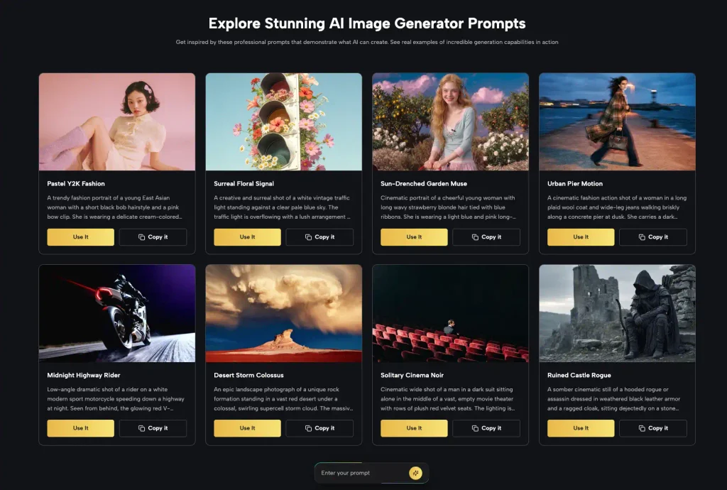
Using a tool such as Nano Banana AI, founders can explore image concepts through written descriptions and reference images. That makes it possible to compare directions before selecting one for professional refinement.
For example, a founder developing a fictional outdoor-reading café could request a warm editorial scene featuring books, natural textures, and understated signage.
A second direction might feature bold illustrations, saturated colors, and playful furniture.
The founder can compare which approach better communicates the intended customer experience.
These generated scenes should be treated as exploration, not finished brand identities. Exact typography, legally distinctive logos, packaging specifications, and production files require separate attention.
A useful result is a clearer description of the desired visual style that can guide later design decisions.
Why Naming and Visual Design Should Inform Each Other
Many businesses treat naming and design as completely separate tasks. First they choose the name, then they instruct a designer to make something attractive.
A better approach allows feedback between the two decisions.
Suppose a boutique travel company chooses the name Quiet Miles. Early visual concepts might reveal that the name works beautifully with calm landscapes and thoughtful editorial imagery.
Alternatively, the same founder may discover that the actual service focuses on high-energy group adventures. The name could then be sending the wrong message.
That discovery is valuable before the company pays for signage, domain-related materials, packaging, or a large advertising launch.
A simple comparison worksheet can help:
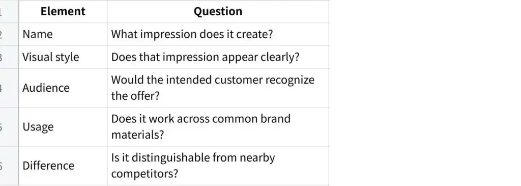
点击图片可查看完整电子表格
The worksheet encourages founders to judge each decision as part of the larger customer experience.
Know When to Stop Experimenting and Make a Decision
Visual exploration can become endless. A founder generates twenty concepts, likes elements from ten, and starts combining incompatible directions.
More options do not necessarily produce a stronger identity.
Limit early experiments to three genuinely different visual approaches. Compare them against the expectations established by the business name and target audience.
Choose one direction for deeper development. Then create a short reference document describing its colors, imagery, emotional tone, and intended uses.
Keep factual requirements separate from artistic preferences. A restaurant sign must be readable. A packaging label may need mandatory information. A logo should not accidentally resemble a competitor’s protected mark.
These issues cannot be solved by visual appeal alone.
Before final production, check trademark availability, spelling, legibility, and any relevant design rights. A generated concept is not proof that an identity is legally available.
The purpose of early testing is to improve decisions, not eliminate the need for professional judgment.
Conclusion
Choosing a business name is only the beginning of creating a recognizable brand. The name sets expectations, while visual design helps customers understand those expectations at a glance. Testing different directions before launch can expose confusing signals, impractical design choices, and unnecessary similarities to competitors. Founders do not need dozens of polished mockups to make progress. A few clear visual concepts, relevant customer reactions, and a practical comparison are often more useful. Before committing to your next brand design, place the name into three realistic customer situations and see whether the complete picture feels consistent.